Introduction
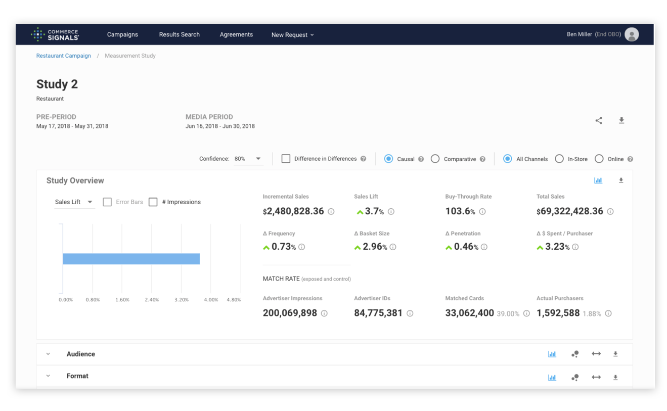
Commerce Signals’ main product, Measurement, is a web application that leverages the company’s partnerships with payment processors to allow marketing agencies to draw a correlation between ad exposure to successful sale of a product. It allows agencies to infer whether or not an ad was successful in driving sales.
Project Background
During my time at Commerce Signals I identified a serious gap between the product development team and the customer. While our client services team was regularly interacting with the customer and helping them complete tasks on our application, they were not well equipped to effectively track interactions and report customer feedback to the product and engineering teams. As the only UI/UX designer at the company, I felt a responsibility to push for change and bring a solution forward. Based on my past experience, I would have preferred to engage with the customer directly and facilitate user testing sessions to understand pain points and asses the customer experience. However, given the nature of our small company and our enterprise clientele, we could not offer incentives for customers to participate in testing. Traditional user testing was not an option. We also didn’t have the budget to sign on for a panel testing service such as User Testing. After a bit of research, I proposed implementing a user tracking software called Hotjar which would record user sessions on our application, provide interaction heatmaps, and allow creation of success tracking on defined tasks, among other features. It was also free for up to 1000 page views a day which was well above what we were seeing.
I allowed Hotjar to collect data for a few weeks and then prepared a presentation highlighting the takeaways and suggesting improvements based on my findings.
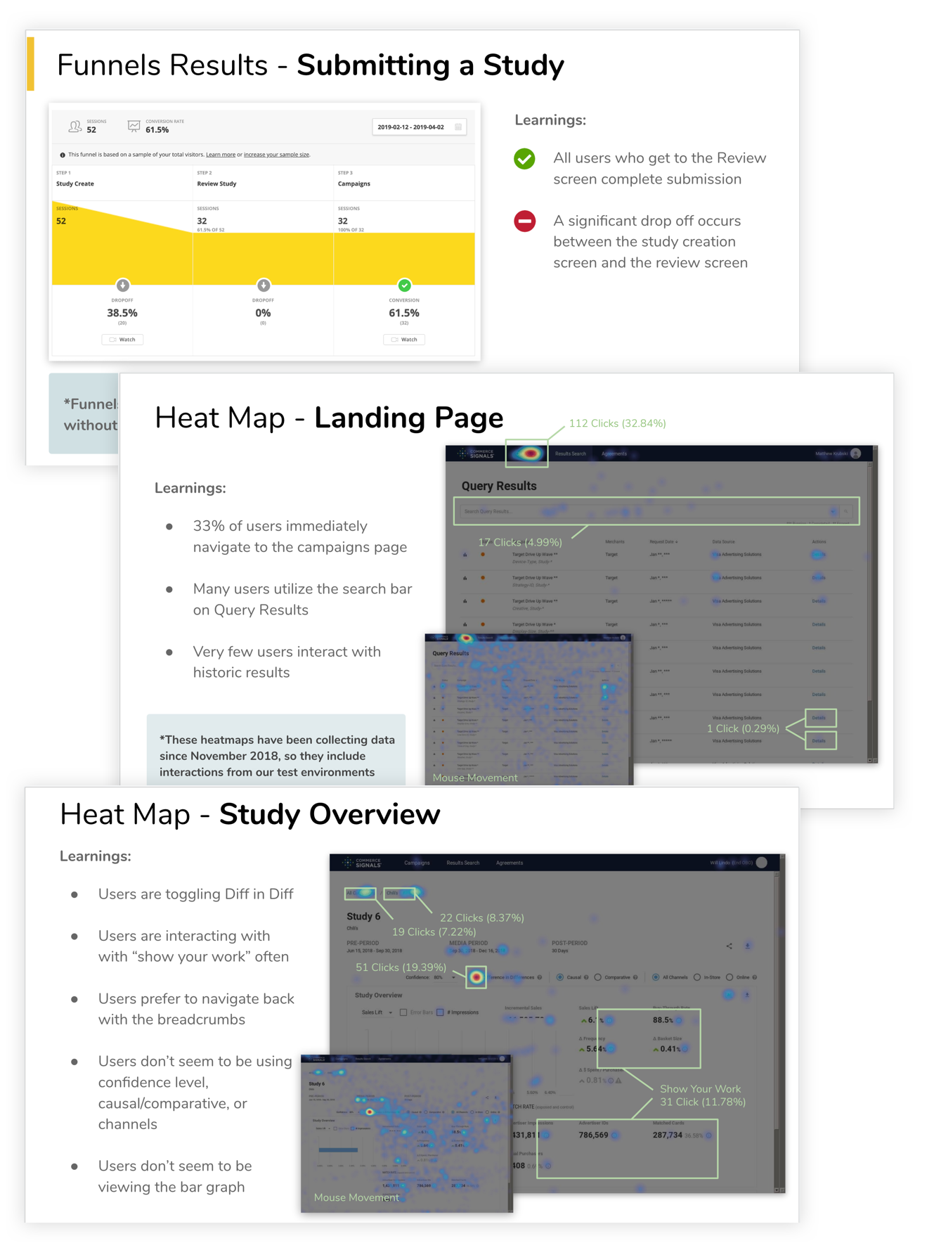
Many of these suggestions were later acted on but for the purpose of this piece we will focus on incorrect study date submission.
The Problem
A significant amount of users are dropping off from completing study submission at the initial study creation screen. Client services has informed us that a fair number of users also submit a study with incorrect dates that they either have to resubmit for the client or, worst case, the client complains when receiving an incorrect study back.
We have identified that users are dropping off from completing study submission because they are unsure which date range to edit in order to receive the study results back the same day as submission. Users leave the study creation screen to navigate back a page out of confusion or to attempt to edit the entire campaign’s date range.
What can we do to add clarity around date submission, knowing that most users wish to receive the study back the same day they submit?
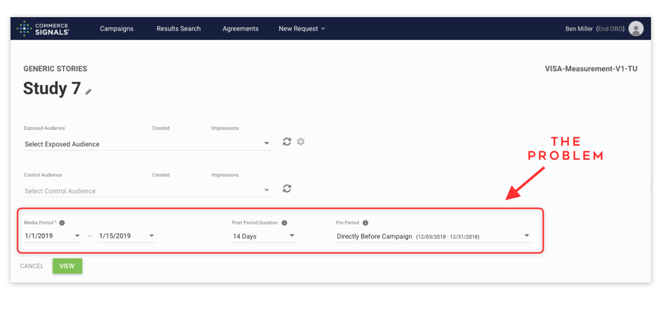
Approaching the Problem:
Upon examining the existing design and monitoring user interactions through our 3rd party software, I concluded that the primary confusion was stemming from the multiple date selection fields and lack of a view of a ‘return’ date. As I watched user sessions, I could see users clicking around, attempting to change the Media Period date, then the Post Period Duration, and then the Pre-Period date fields to try to create the perfect storm needed to get the study to be returned on today’s date. In most cases, the appropriate solution would have been to adjust the post period duration to ‘0 days’. The Post period was defaulted to 14 days to allow 2 weeks beyond the Media Period to capture sales data of individuals who viewed the ad during the media period but didn’t purchase until up to 2 weeks past the date the ad stopped running. However, most agencies had preemptively added this post period into their Media Period and were logging into Commerce Signals to submit the study for a same day return. I’m sure even reading this explanation of the date ranges is unpleasant and confusing, so you can imagine my haste to simplify this experience.
I identified the following opportunities for added clarity
- Provide a reactive display of the ‘return’ date that dynamically changes as the user adjust date fields
- Simplify date selection by making labels more descriptive, adding tooltip explanation text, and reducing the number of necessary selections if possible
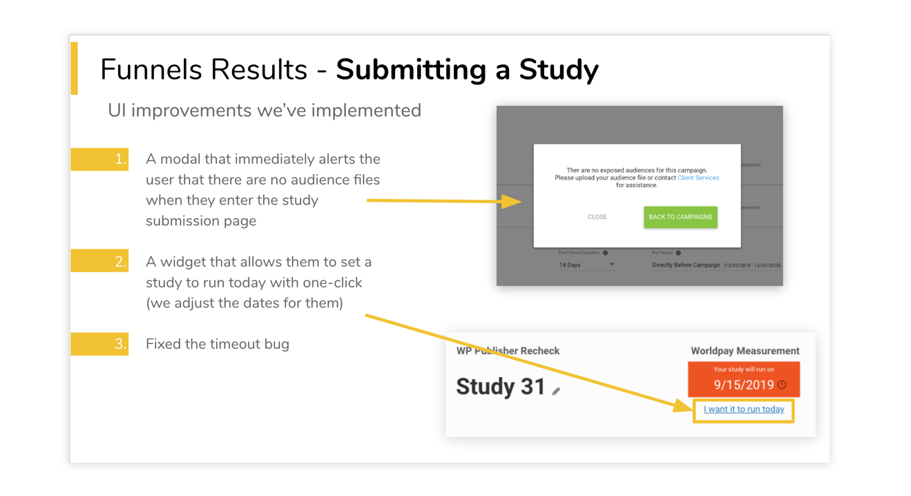
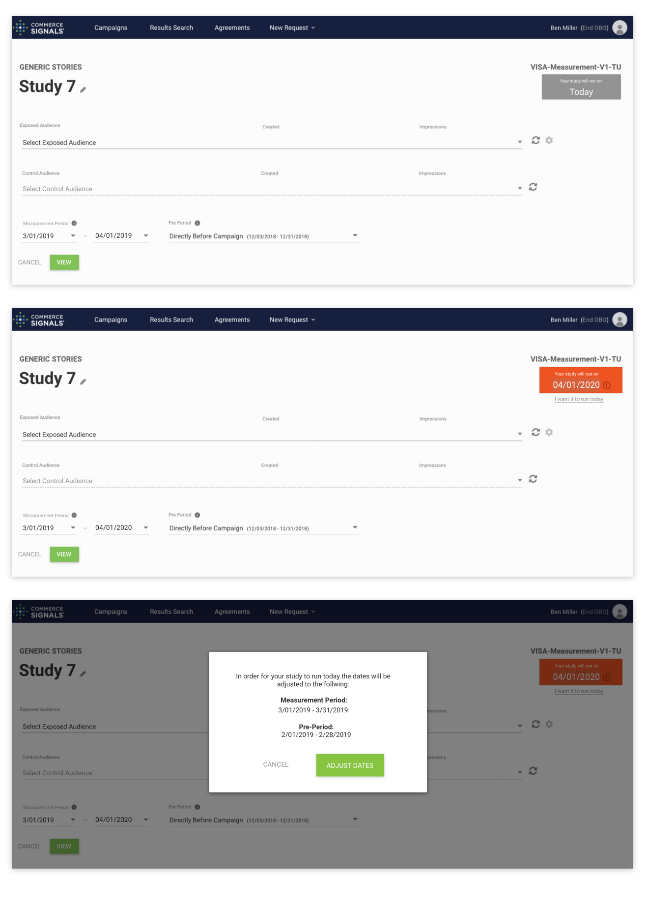
- Provide a way for the user to quickly and simply adjust the date to ‘run today’ without having to understand each date range
I created mock ups and a prototype that showed how adding these changes would affect the experience. After workshopping these ideas around internally, gaining consensus with product, client services, and engineering that this was a viable solution, we implemented the improvements.
I monitored interactions after the implementation and was pleased to find that users were more successful at submitting studies for the proper run date. When entering the study submission module, the user’s mouse would hover over the orange indicator that the study was set to run at a future date.
